Commercial Vehicle Wraps in Rochester, Dodge Center, and the entire southeastern Minnesota area
The right graphics are essential for any successful fleet rebranding. They can be the difference between a company’s success and failure, and that is why it is so important to get them right. We have learned many lessons about what makes a good fleet wrap design from our years of experience in this industry. In this article, we will share some of those elements with you to help make your upcoming project more successful!
Making the Design of the Fleet Graphic Flexible
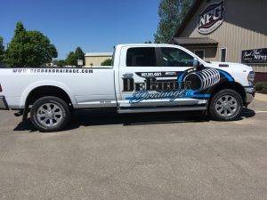
The design of your fleet graphics should not be too complicated because it can only fit onto one side. Too many elements will result in a graphic that presents a blurry image (figuratively and literally). The design should also be flexible to fit the size of your fleet. Essentially, this can be useful for any commercial vehicle wrap- no matter the year, make, or model of the vehicle.
The Size of the Fleet’s Graphic
When designing a commercial vehicle wrap for any company, the size of the graphic is important to consider. The main idea is that the graphic needs to be proportionate. In other words, the design needs to be at least as tall as the vehicle it will go onto. This means that any graphic, for a truck wrap or limo company, should be taller than it is wide.
Choosing the Right Combinations of Colors for the Fleet
There are a few simple rules to follow when it comes to color combinations. First, you should choose complementary colors that balance each other (e.g., blue and yellow). Second, the number of colors must be limited- ideally two or three shades at most. Third, the color palette should match the industry’s colors. Finally, use only one bright color for accents throughout the design.
Placement of the Graphics on the Fleet
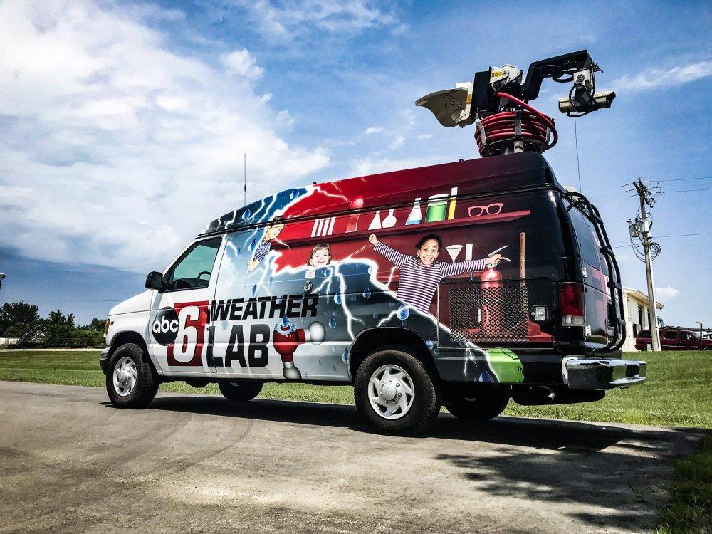
The placement of the graphic design on a fleet should be done strategically. Sure, the longest space available in the side of the vehicle; but, that does not mean that it is the best place. Typically, the back of a fleet will be seen as much (if not, more) than the side. Undisputedly, the best location for your graphics is at eye level, right in front and center of the vehicle, so that it attracts attention when people are driving by. Most of the time, these graphics give the first impression of your company. That is why it is vital to make the most out of the placement of the graphic.
Blank Space within Fleet Graphics
One way to make an entire fleet look cohesive is by including an appropriate amount of space in between multiple graphics (or a single graphic if placed in a non-uniform color region). A good rule of thumb is to leave at least an inch or two between graphics. This will allow enough room for the eye to move around and not be overwhelmed with one graphic on top of another. The best way to ensure adequate spacing within a fleet wrap design is by using a vector-based program like Illustrator or Adobe Photoshop. Even with the exponential growth in technology, it is not a bad idea to start on a piece of paper.
Our business is to make your business look good. Whether you are looking for a commercial vehicle wrap design, vehicle graphics, or car wraps in general, we want to help you create the best possible marketing message that will draw new customers and boost sales. We’ve been designing successful fleets of all shapes and sizes for years now, so when it comes time to replace those old stickers on your trucks with something fresh and exciting—we can help!
National Fleet Graphics is a family-owned and operated custom design and branding company specializing in a variety of branding from vehicle graphics and wraps, to signs and banners, to decals and apparel. With a skilled team of designers, producers, and installers, we are proud to provide the highest quality graphics that will help your business stand out from the crowd. As we like to say, “Our business is to make your business look good.” Contact us to bring your next project to life!
