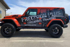
Fleet vehicle graphics are a powerful method to highlight your brand and broaden your reach.
They can leave a strong impression and build brand recognition when done right.
However, designing compelling fleet graphics isn’t as easy as slapping a logo on the side of a van.
Several common mistakes can reduce the impact of your design, leading to missed opportunities and wasted resources. To help you avoid these pitfalls, here’s a blog post on the critical mistakes to avoid when designing fleet graphics.
Overcomplicating the Design | Fleet Vehicle Graphics
A vehicle has limited space, and it’s essential to focus on simplicity. Overloading your design with text, images, or overly complex elements can confuse viewers. Instead of capturing attention, an overcrowded design might leave people unsure of what you’re trying to communicate.
- Stick to your core message or brand identity.
- Prioritize your logo and contact details over unnecessary graphics.
- Use bold and clear fonts for readability.
Remember, the goal is to be memorable, not overwhelming.
Ignoring Readability and Legibility
Fleet graphics are often viewed while in motion, so your message must be easily read. Many business owners make the mistake of choosing fancy fonts or placing text in hard-to-see areas of the vehicle.
- Choose simple, clean fonts that are easy to read from a distance.
- Ensure the text is large enough to be visible at various angles and speeds.
- Contrast the text color with the background for maximum visibility.
If people can’t quickly identify your brand and contact information, your design isn’t doing its job.
Using Low-Quality Images
Another common mistake in fleet graphics design is using low-resolution images. Since these graphics are often blown up to fit large vehicles, low-quality images can appear pixelated or blurry, reflecting poorly on your brand.
- Always use high-resolution images or vector files to ensure clarity.
- Test how the design looks on the vehicle before finalizing it.
- Avoid stock images that don’t align with your unique brand message.
By investing in high-quality visuals, your fleet graphics will look professional and clean, even from a distance.
Also Read: How to Design Commercial Fleet Graphics for Maximum Impact
Forgetting About Vehicle Shape and Size
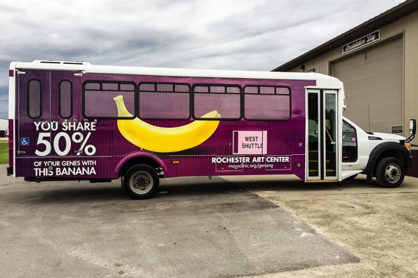
Every vehicle is different, and a one-size-fits-all approach rarely works for fleet graphics. Ignoring each vehicle’s unique shape and size in your fleet can result in distorted or misaligned designs.
- Tailor the design to fit each vehicle’s curves, doors, and windows.
- Consider how the design will look when the vehicle is in motion or parked.
- Ensure that door handles, mirrors, or windows obscure no vital information.
A customized approach will ensure your commercial fleet graphics look polished and cohesive, regardless of vehicle type.
Failing to Align with Brand Identity | Fleet Vehicle Graphics
Your fleet graphics should be an extension of your overall branding. However, many businesses make the mistake of using colors, fonts, or imagery that don’t align with their established brand identity.
- Stick to your brand’s color palette to ensure consistency across marketing channels.
- Use your logo prominently, but ensure it doesn’t dominate the entire design.
- Incorporate elements that match your website, social media, and other advertising materials.
Designing fleet vehicle graphics requires careful consideration of factors like simplicity, readability, and alignment with your brand. Avoiding common mistakes such as overcrowded designs, unreadable text, and poor-quality images can help you create eye-catching, compelling fleet graphics that leave a lasting impression.
National Fleet Graphics delivers high-quality vehicle graphics that enhance your brand’s visibility. With expert design, durable materials, and attention to detail, we create eye-catching graphics tailored to your needs.
Contact us today.
