Banners can be powerful marketing tools when designed the right way.
They grab attention, share your message, and draw people in.
However, a poorly designed banner can do the opposite.
It can look unprofessional and fail to get results.
Whether creating custom banners in Rochester, MN, or anywhere else, avoiding certain mistakes will help you maximize your investment.
Overcrowding the Design
Trying to fit too much information on a banner is a common mistake.
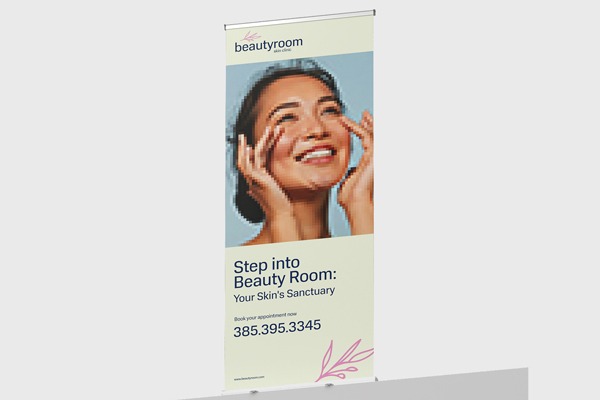
Your audience should understand your message in just a few seconds. Too much text or too many images make it hard to focus. Keep your design clean & easy to read. Highlight only the most important details. For example:
- Business name
- Key offer or message
- Contact information
A minimal yet elegant design often makes a stronger impact than a cluttered one.
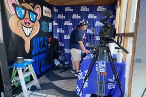
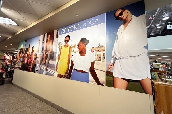
Using Poor Quality Images | Custom Banners in Rochester, MN
Low-resolution images can make your banner look blurry or pixelated. This gives an unprofessional impression. Always use high-quality images that stay sharp even when enlarged.
If you’re unsure, work with a designer who understands image resolution for large formats.
A crisp photo or logo can instantly make your banner stand out.
Choosing the Wrong Fonts
Fancy or overly decorative fonts may look appealing at first. But if they’re hard to read from a distance, your message gets lost. Stick to clear, bold fonts that are easy to read. Limit yourself to one or two font styles for a consistent look.
Good typography plays a big role in achieving an elegant design.
Also Read: Tips for Creating a Cohesive Look with Custom Banners
Ignoring Color Contrast
If your text blends into the background, people won’t be able to read it.
Poor color contrast is a big design flaw. Always choose colors that stand out against each other. For example, dark text on a light background or light text on a dark background.
Proper contrast makes your message pop and improves readability.
Not Considering Viewing Distance | Custom Banners in Rochester, MN
Banners are often viewed from far away.
If your text is too small, people won’t be able to read it. Ensure your font size matches the banner’s size and expected viewing distance.
As a general rule, larger banners need larger text.
Testing your design at scale can help you spot any issues before printing.
Forgetting the Call to Action
A banner should guide the viewer to take the next step.
Without a clear call to action (CTA), your audience may not know what to do next. Use short and direct CTAs like “Call Today,” “Visit Our Website,” or “Stop By Our Store.”
If you’re promoting custom banners in Rochester, MN, a clear CTA ensures your message leads to action.
Overlooking Brand Consistency
Your banner should match your overall branding. This includes using your brand colors, fonts, and style.
A design that looks out of place can confuse your audience.
Consistent branding creates trust and recognition. It also adds to an elegant design that aligns with your business identity.
Conclusion | Custom Banners in Rochester, MN
A well-designed banner is a powerful way to attract attention and promote your message.
Avoiding overcrowding, poor image quality, and weak CTAs will help create an effective display.
When your banner is clear, visually appealing, and consistent with your branding, it will work harder for you.
Whether making custom banners in Rochester, MN, or anywhere else, aim for clarity, professionalism, and an elegant design that captures attention and drives results.
National Fleet Graphics can create banners that are clear, eye-catching, & aligned with your brand.
Contact us today.